Palette Set Up for Oil Painting
Katie Liddiard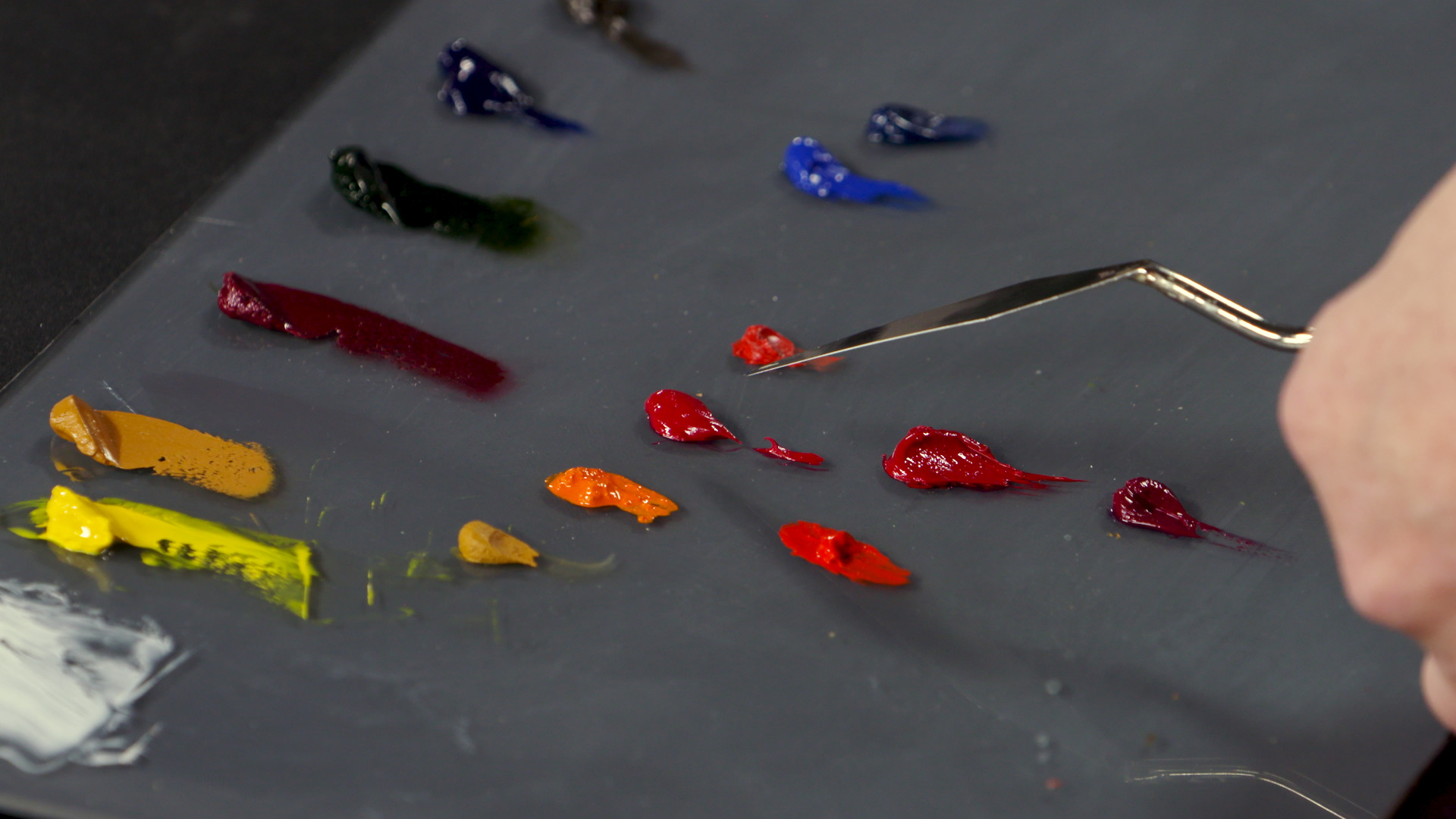
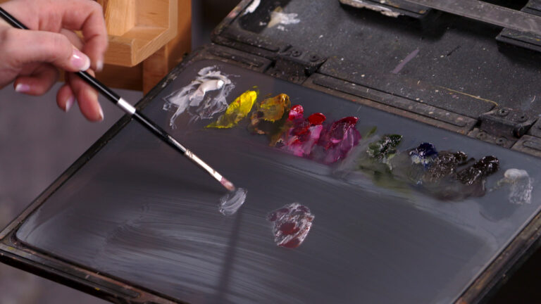
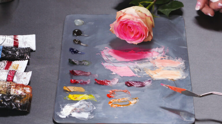
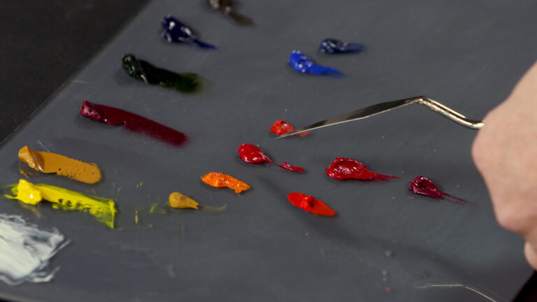
“By maintaining a consistent palette setup, as artist Katie Liddiard does, you’ll always know where to reach for the color you need. For her basic palette setup, Katie begins the row of light to dark and warm to cool paints with lead white, a creamy, warm white (titanium white is also an option). Cadmium lemon is next on the palette, followed by yellow ochre, a classic earth tone used by countless artists. Alizarin permanent is next, an all-around cool, earthy red.
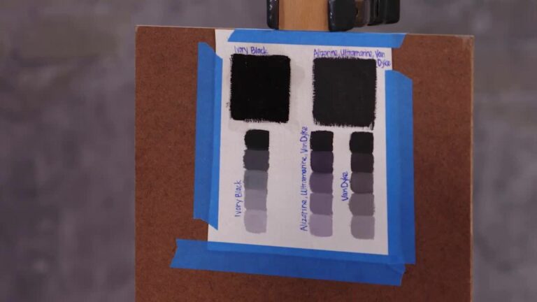
Katie then adds versatile sap green, followed by ultramarine, the classic artists’ blue. Katie’s browns follow, including raw umber, a neutral hue that allows her to add red or blue to shift the temperature of the mixed color, and Van Dyke brown, a neutral grey and the darkest dark on the palette. Katie uses this as a black tone in addition to mixing blacks. Oleo gel, a linseed oil gel, sits on the palette as well and completes Katie’s row of fundamental pigments.
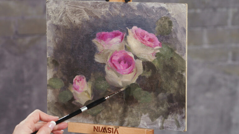
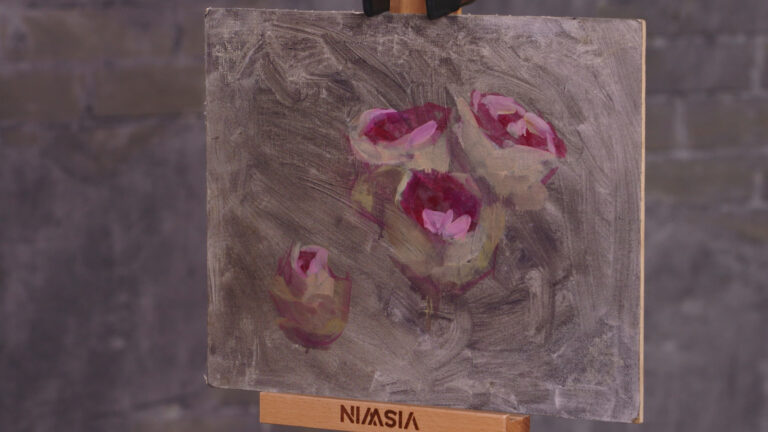
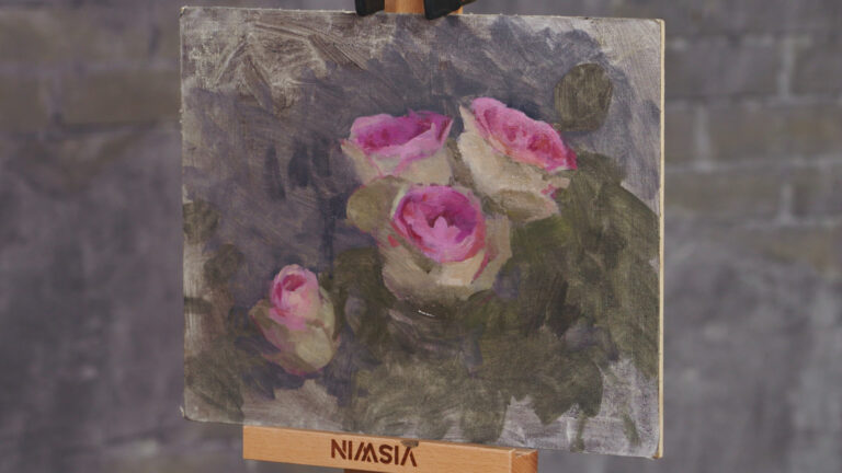
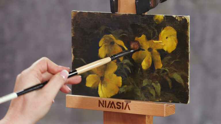
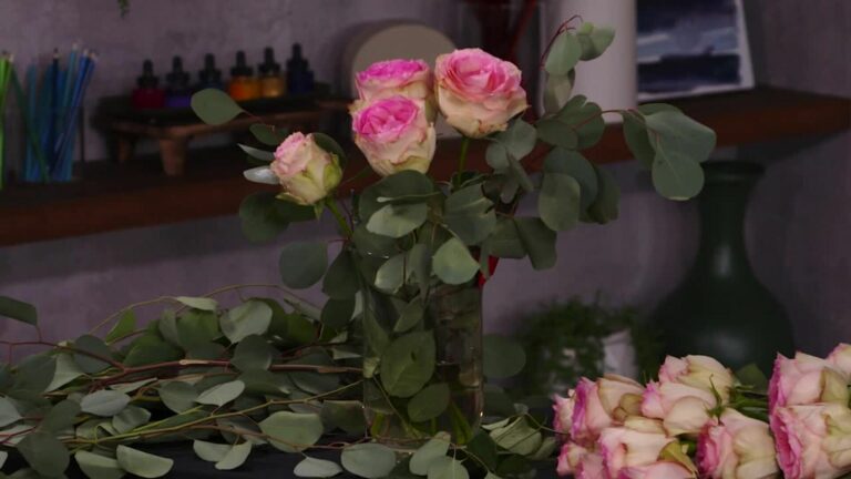
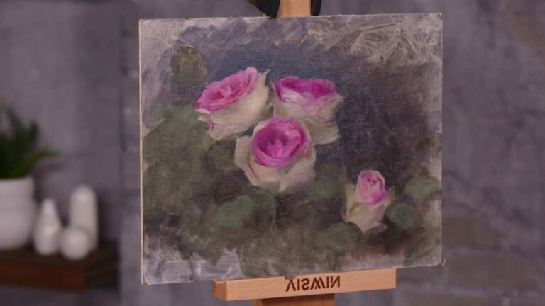
Katie brings in variations for different types of subjects. For the subtle hues she likes for portraits, she adds lemon ochre, which is softer than the yellow ochre in her basic palette. Genuine vermilion is a gorgeous soft pink-red for portraiture, and genuine lazurite (lapis lazuli) is a blue similar to ultramarine but slightly greyer and more subtle, for soft undertones of flesh. For floral subjects, Katie brings in quinacridone red, rose, and magenta, all punchy bright pink hues that stay vivid when mixed with white. Cadmium orange and orange molybdate are potent warm pigments to round out this palette. Finally, for landscape, Katie says, nothing compares to cobalt blue for skies.
“